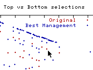
An interesting relationship is revealed through the scatterplot. Many of the points lie on a line that slopes down to the right. That shows that as water temperature increases, in general, dissolved oxygen decreases. This relationship seems stronger once the best managment practice is implemented.