Activity 2
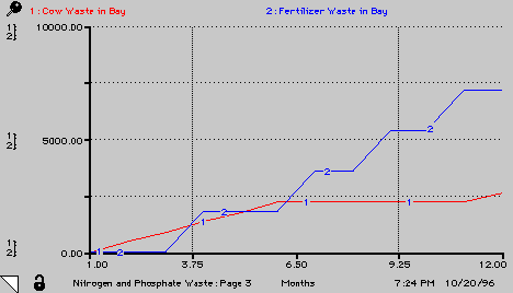
Run the model and answer the following questions: (or see graphs below)3. Look at page 3 of the graph pad:
- Which 100 acre lot dumped the most nitrogen and phosphate waste in the bay in one year?
- Did your answer to number 1 agree with the results from number 3?
- At the end of one year, how much waste has the Housing Development dumped into the bay?
- At the end of one year, how much waste has the Dairy Farm dumped into the bay?
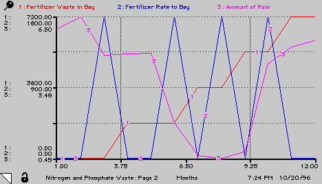
4. Look at page 2 of the graph pad:
- Explain why Fertilizer Rate to Bay has four spikes.
- What is the amount of each spike?
- Explain why the shape of Fertilizer Waste in Bay increases, then levels out, then increases and levels out.
- Explain the Amount of Rain graph.
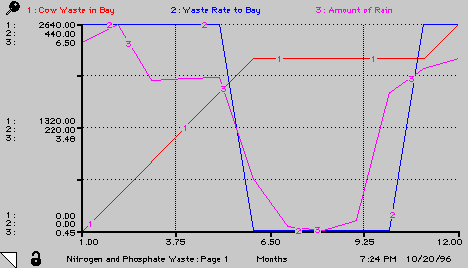
5. Look at page 1 of the graph pad:
- Explain the shape of the Waste Rate to Bay graph.
- Explain why the shape of Cow Waste in Bay increases, then levels out, then increases again.
- Why does the Amount of Rain graph look familiar?
- At what time does Cow Waste in Bay surpass Fertilizer Waste in Bay?
Question 4 Graph
Question 5 Graph
Great Waste Debate | Activity 1 | Activity 2 | Activity 3 | Activity 4